Investigating Netflix Movies
Follow my journey!
Investigating Netflix Movies
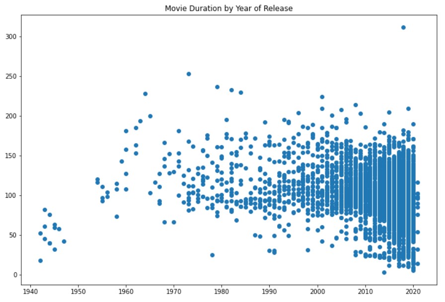
In this guided project, we were tasked to determine if the average duration of movies has been declining. The Netflix dataset was provided, "netflix_data.csv". To determine the dataset's contents, I used "netflix_df[0:5]" to print the first five rows. Television shows are included in the dataset, so this can skew the average duration. The next step is to filter for just movies using "netflix_df[netflix_df['type'] == 'Movie']" and calling this netflix_df_movies_only. We further filter the dataset but selecting columns of interest. A scatterplot was used to visualize the data, which revealed that there are movies less than 60 minutes long, which can skew the average duration
Using, "short_movies = netflix_movies_col_subset[netflix_movies_col_subset['duration'] < 60]", I filter the dataset to restict duration to be less than 60 minutes long and print the first twenty rows with "short_movies[0:20]".
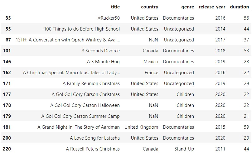
As you can see from the table above, we have several genres that tend to be less than an hour-long, for example, documentaries. Instead of eliminating these data points, I was tasked to mark them with a different colour. I used a loop to generate a list of colours based on the contents of the genre column.
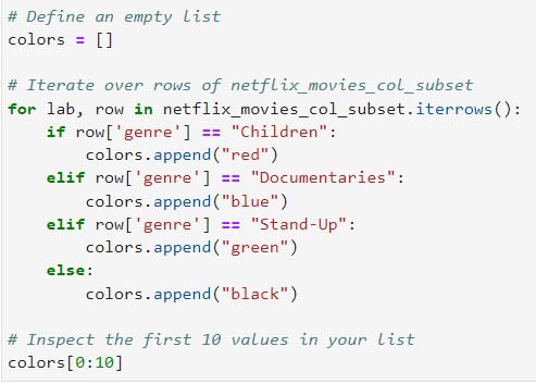
Doing this part of the project was the most challenging, but I had a lot of fun! Essentially, I defined an empty list called colors. In it, I will run a loop along the dataset to fill the empty list with colours based on the genre. The 2nd line of code tells Python to iterate over each row and identify the colour using the conditions below. The code, "colors.append("red")" updates the colors list if the genre is equal to Children.
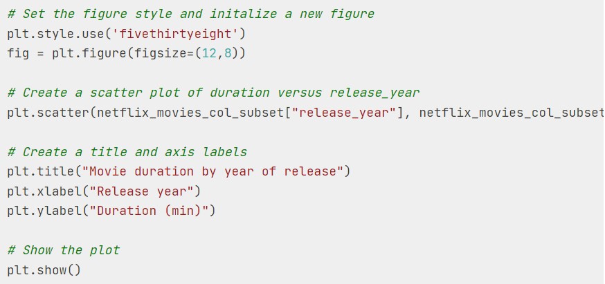
The code above creates a scatterplot of the newly updated dataset. A part of the code is cutout but here it is, "plt.scatter(netflix_movies_col_subset["release_year"], netflix_movies_col_subset["duration"], c=colors)". When I first tried to code the scatterplot, I used, "plt.scatter(release_year, duration)," which wouldn't work because both aren't defined. By the way, the code takes the form, "plt.scatter(x,y, c=...)". I was confused as to how I would connect my color list to my scatterplot but you set c equal to colors. Since my x and y aren't defined, I would have to filter the dataset to only select "release_year" as y and "duration" as x. to fill the empty list with colours based on the genre. The 2nd line of code tells Python to iterate over each row and identify the colour using the conditions below. The code, "colors.append("red")" updates the colors list if the genre is equal to Children.
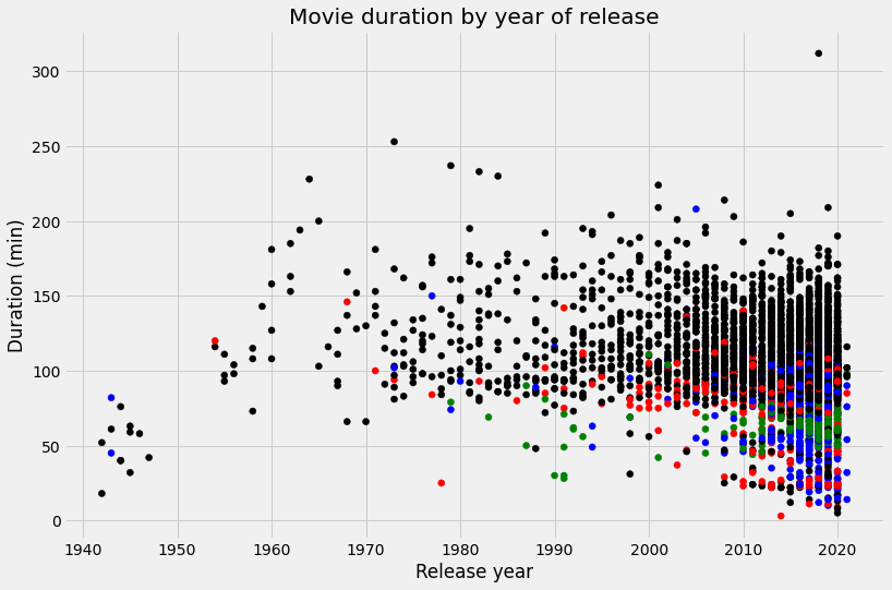
Based on the above chart, can we conclude that the duration of movies has been declining? Maybe. Additional exploratory analysis is needed. Coming soon.